Revaly Case Study
Revealy has since changed its name to CADchat. The product itself has not changed. The website name and link have been updated.
When was this?
October 2021 – March 2023
Website
What’d I do?
- User Research
- Usability Testing
- User Journey Map
- Design System
- Branding
- Icon design
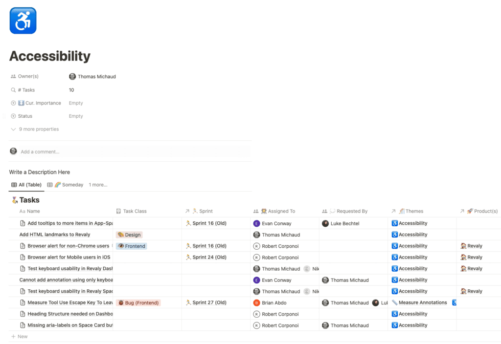
- Accessibility
What’d I Work In?
- Figma
- Miro
- Notion
- Google Suite
- Adobe Creative Cloud
Introduction
Revaly (now CADchat) is a web-based tool for 3D design to help a team share and provide feedback. Our platform allows your production team to collaborate seamlessly. We make it easy to create quick prototypes and get to market fast.
The Challenge
Looking at product designs and providing feedback quickly is important. No matter the product, it’s important to have the right tools to work with your team. That way, you can make good choices before going to production.
Initial Exploration & Research
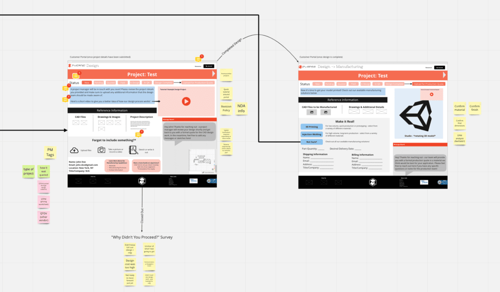
When I started at ZVerse, my first focus was the Design-to-Manufacturing platform.
From what I was hearing, the design process wasn’t very smooth.
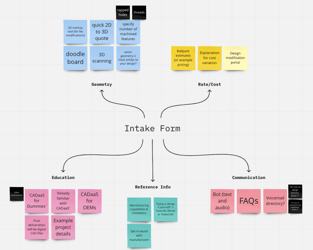
The goal: improve the customer’s experience, along with the Project Manager and CAD Designers. I set up a time to talk with customers who used our services to ask them about their experience.
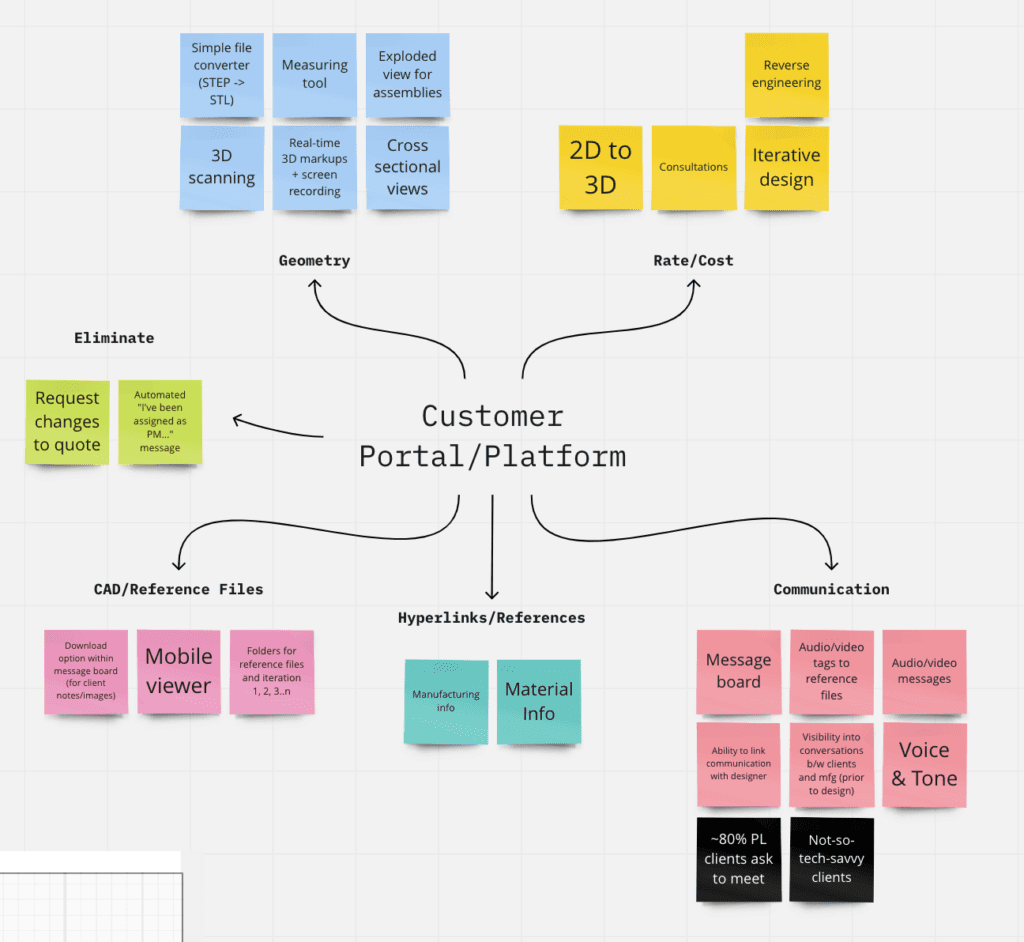
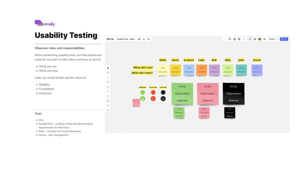
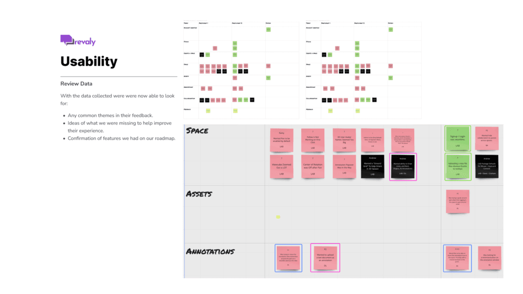
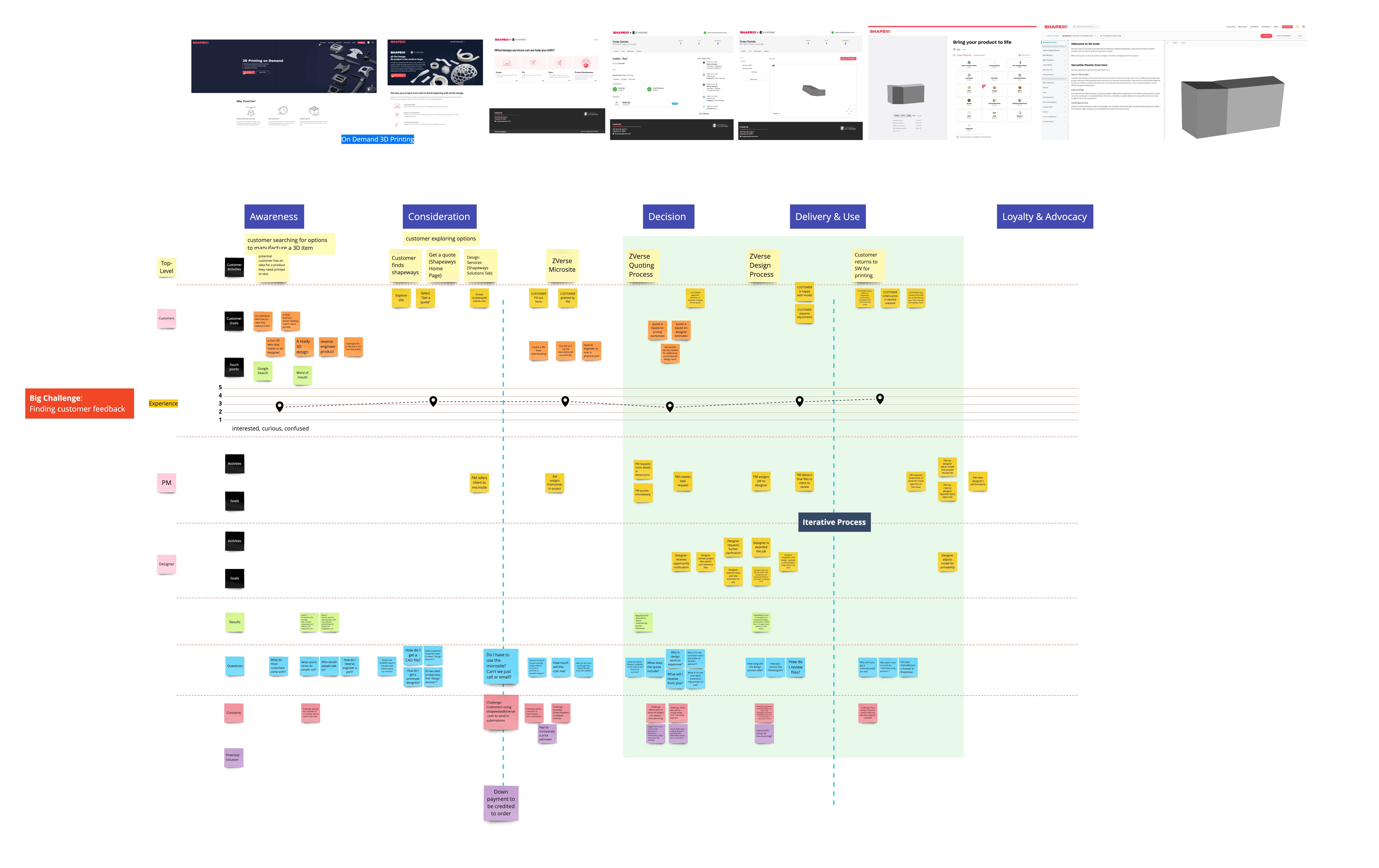
Talking with customers about their experience with ZVerse’s manufacturing process helped to uncover the delights and frustrations. Using the interviews helped organize our findings from customer research and create a customer journey map.
The journey map helped us uncover problems—with our product and maybe other systems too.
Design Studio & Wireframes
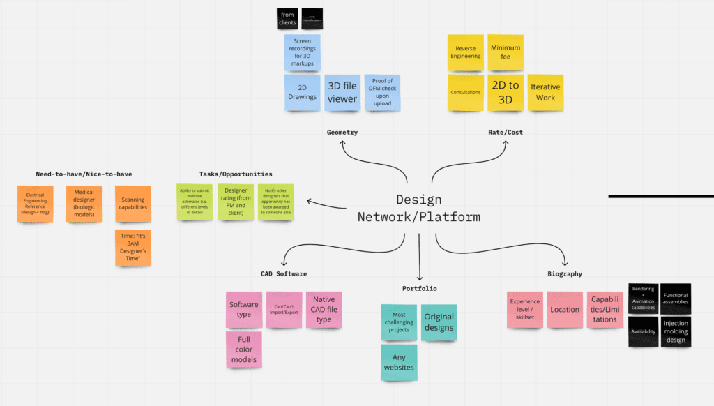
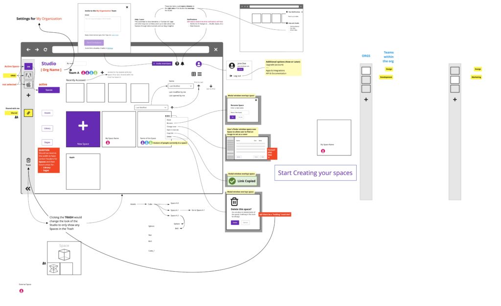
Working with cross-functional teams in a Design Studio helped generate ideas to help solve the problems they had collaborating with customers.
Our research found communication between the customer’s idea and the final delivery was challenging during the design phase.
How can communication and collaboration improve?
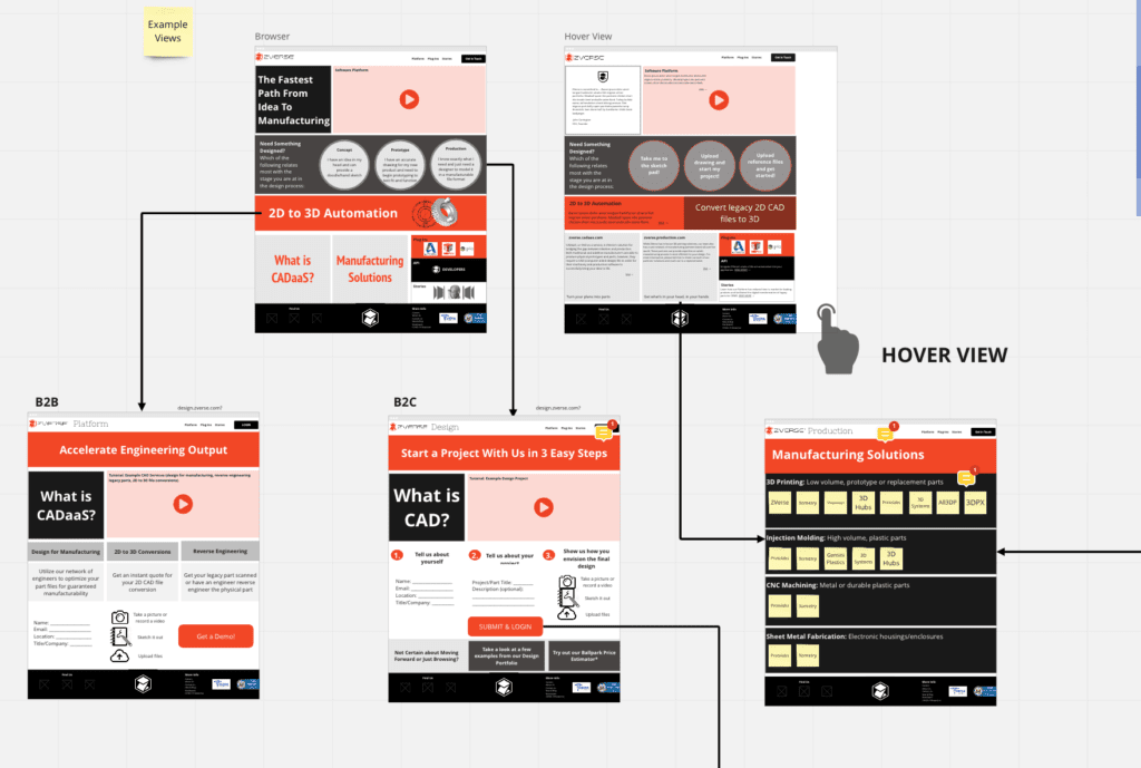
Sticky notes and low-fidelity wireframes helped facilitate conversations and think through ideas. Higher-fidelity wireframes then helped communicate design to the engineering team.
Usability Testing
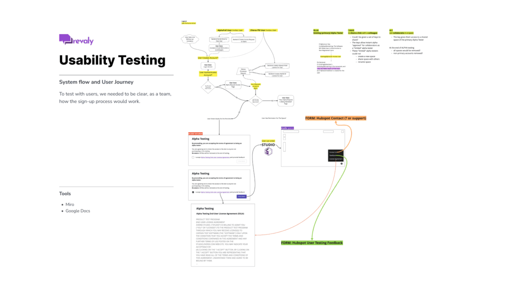
Once the product was usable, we began the Alpha stage of testing.
We started working through the sign-up / login process and worked through scenarios to make sure we could test:
- Can users create a Space?
- Can users upload assets? Do they know limitations?
- Can a user share a link to a Space?
- Can users collaborate in a Space?
- Can we make sure we can collect feedback via HubSpot?
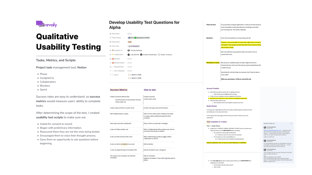
Success rates are easy to understand, so success metrics would measure users’ ability to complete tasks.
After determining the scope of the test, I created usability test scripts to make sure we:
- Asked for consent to record.
- Began with preliminary information.
- Reassure them they are not the ones being tested.
- Encouraged them to voice their thought process.
- Gave them an opportunity to ask questions before beginning.
Studio Product Demonstration
Revaly Product Demonstrations
Accessibility and Continuous Improvement
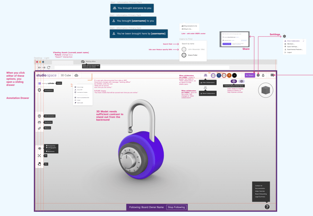
Accessibility ensures the product is usable and useful to anyone without barriers.
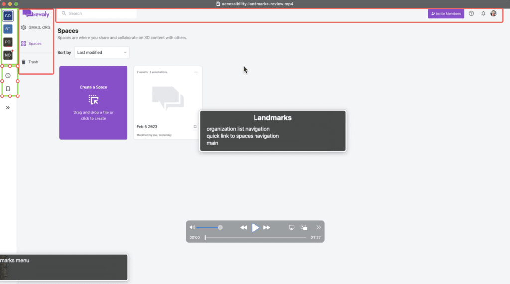
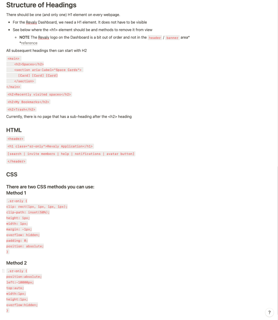
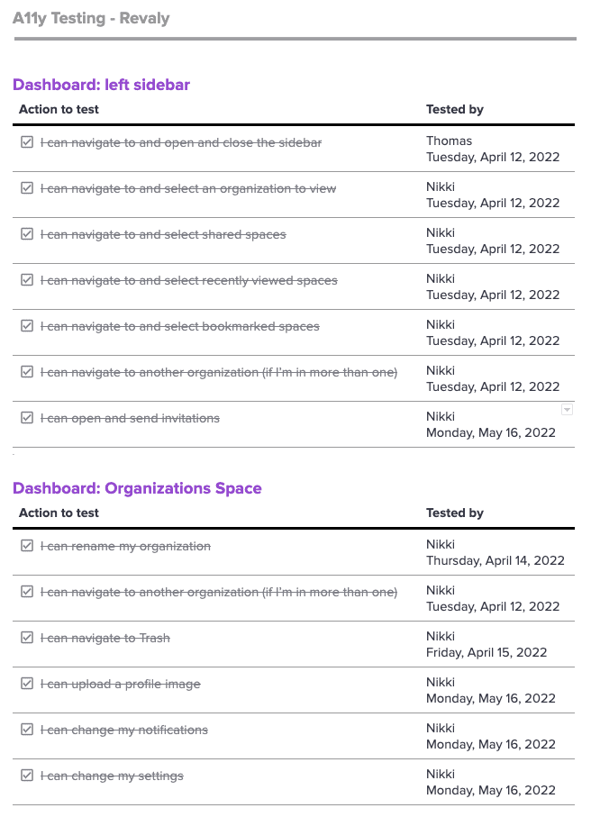
Automated accessibility tools like WAVE and color blindness simulators are used along with manual testing using Apple’s Voice Over to test accessibility. Tests also include recruiting folks with (temporary and life-long) disabilities and other manual testing methods.
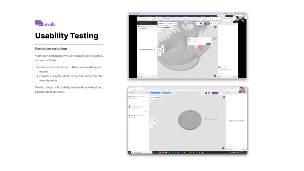
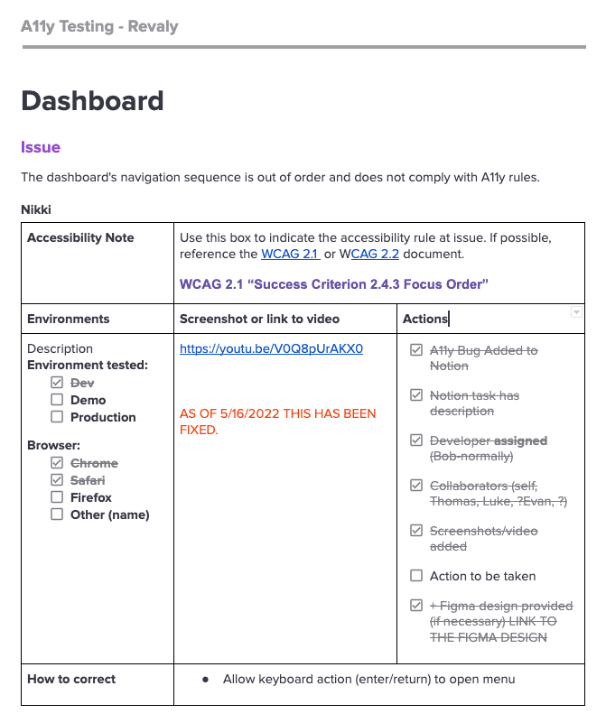
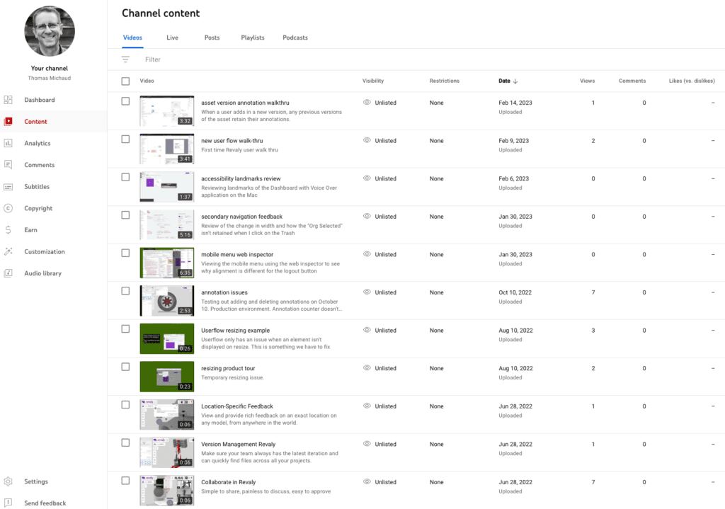
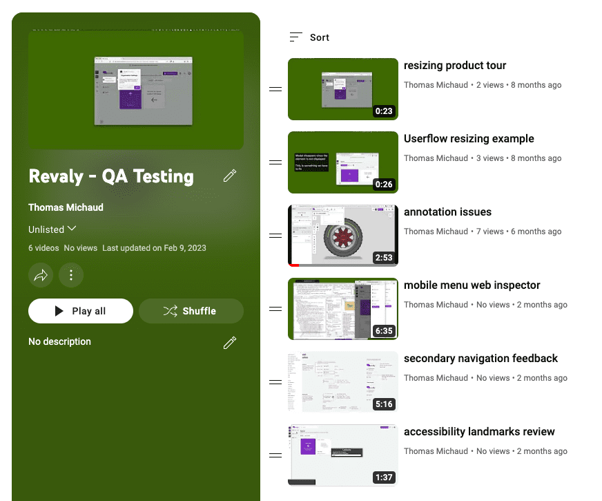
Video recordings were also used to help communicate issues and ideas for solutions to the engineering team.
Throughout the development and design process, we look for continuous improvement of the experience and interaction of Revaly. Any new push of code requires us to re-test components and scenarios to see if anything affected accessibility.
The biggest challenge: Developing and testing accessibility within the 3D canvas.
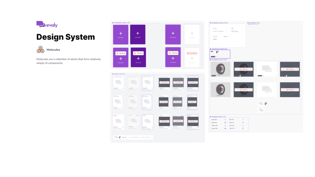
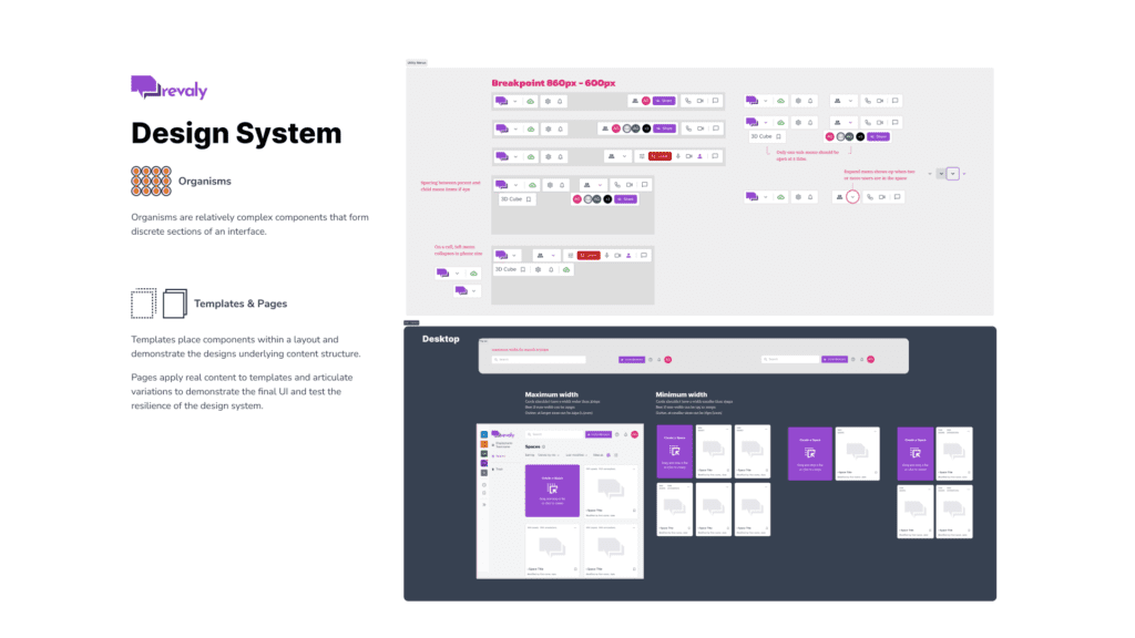
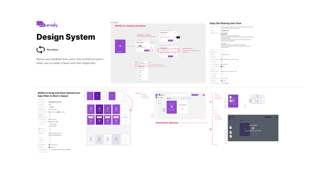
Design System
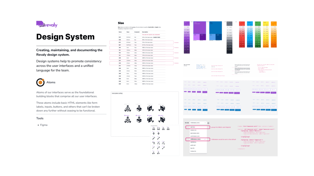
I started using a framework—Tailwind—but soon discovered we needed our own design system because of the unique requirements of our UI and the custom iconography we needed.
While initially following the structure of the Atomic Design method, the Washington Post’s Design System of: Foundations, Components, and Resources became an easy pattern to follow for our small team.
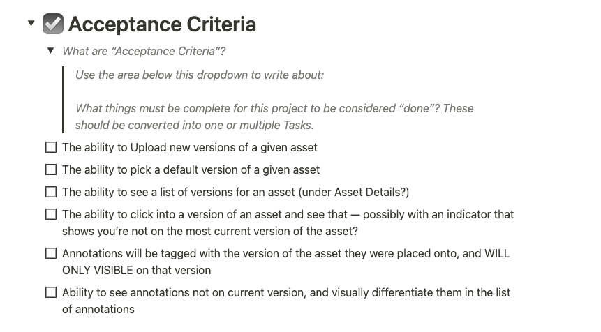
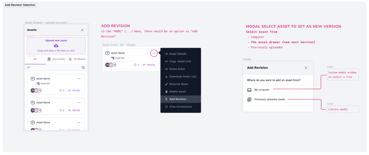
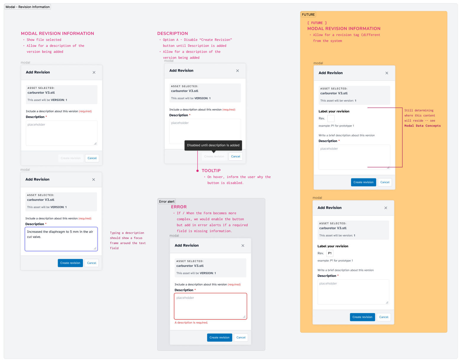
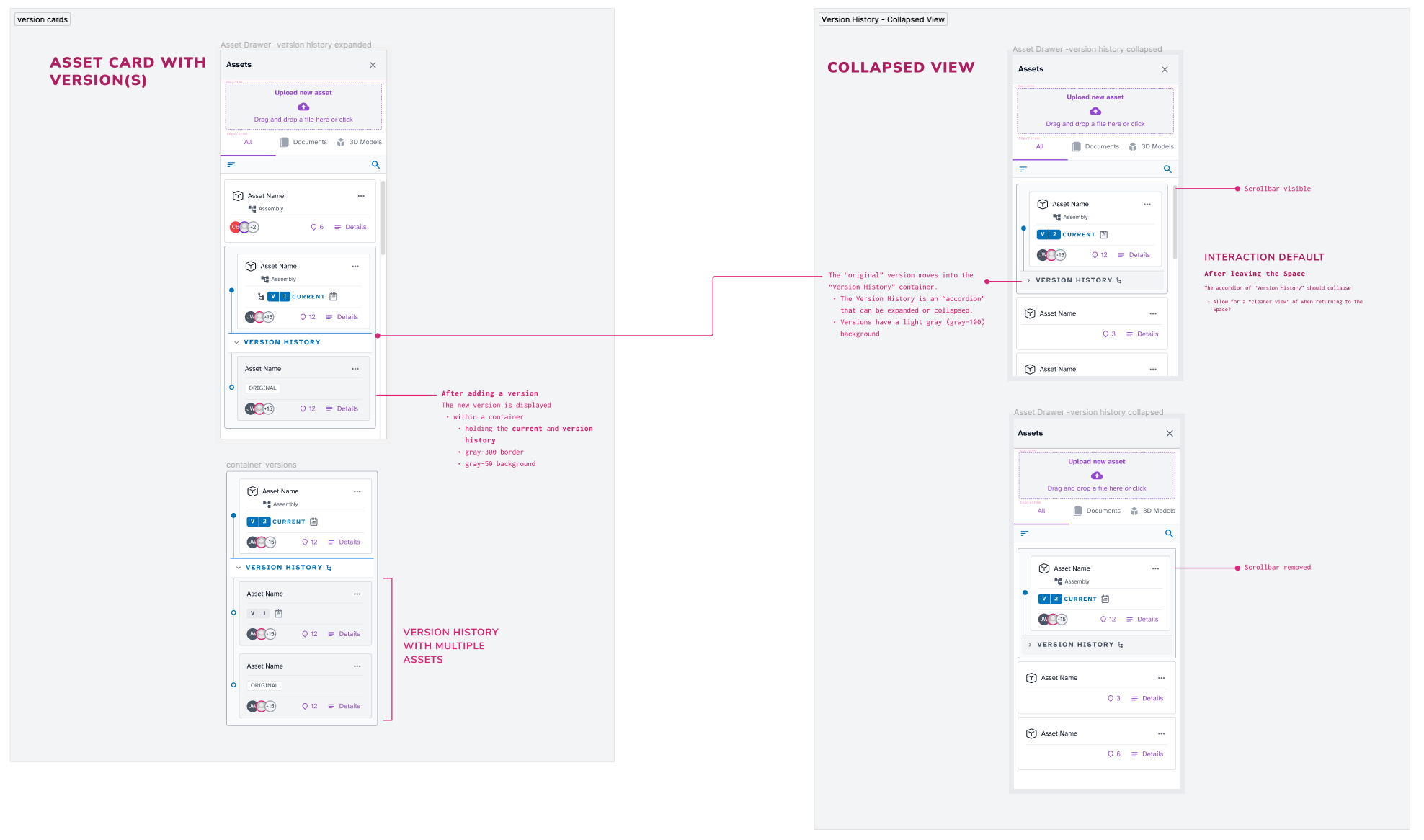
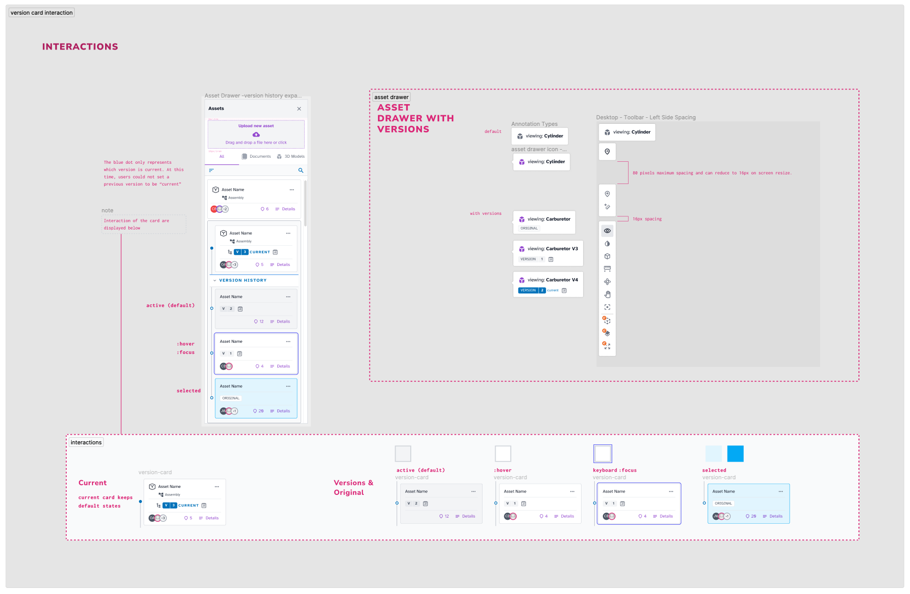
Feature: Versioning
Task
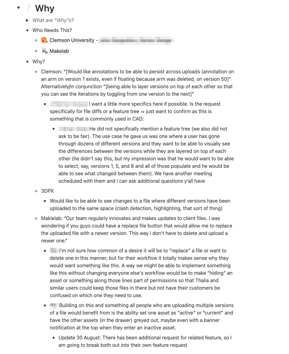
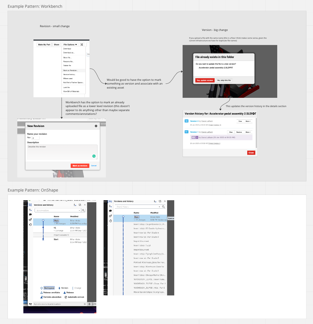
Collaborating with sales and marketing to learn how implementing versioning will help our customers manage the progress of their product design. We look at other applications to see how they’re handling versioning.
Discovery
Customers regularly innovate on flies. They need a way to replace or add a new version. Customers could track from the original to the latest version during their process.
Exploration
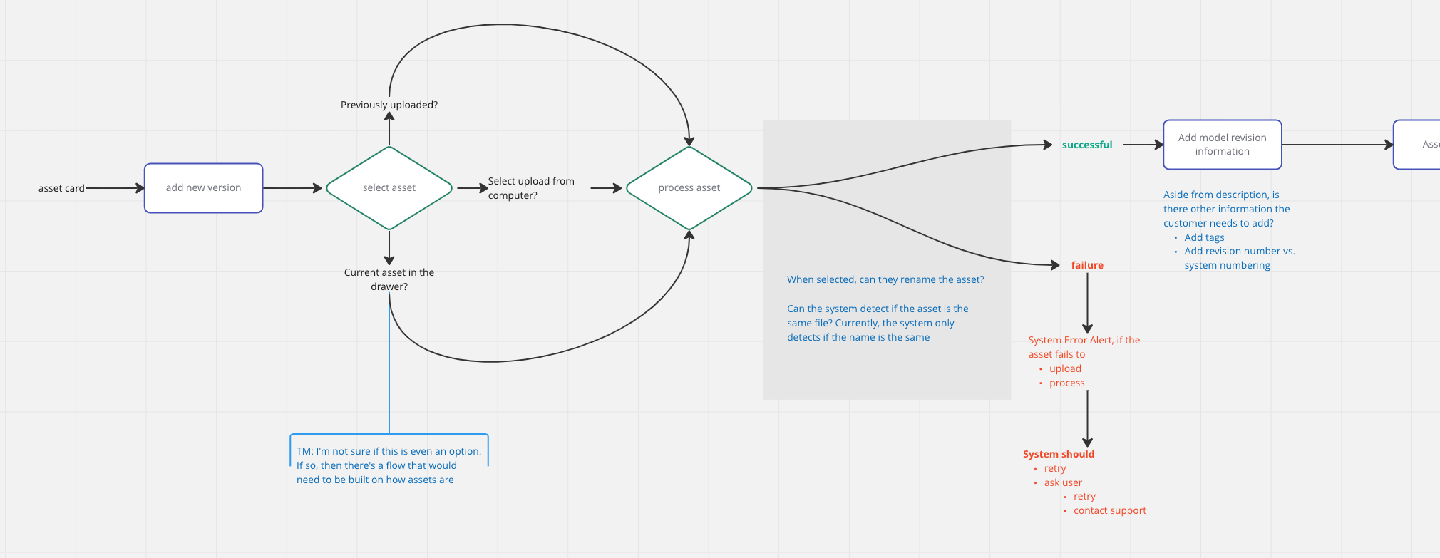
Discovery helped to inform how the flow of creating a version would occur. I developed flow diagrams to collaborate with engineering. Through the conversations, we talked through questions, concerns, and ideas.
Design and Development
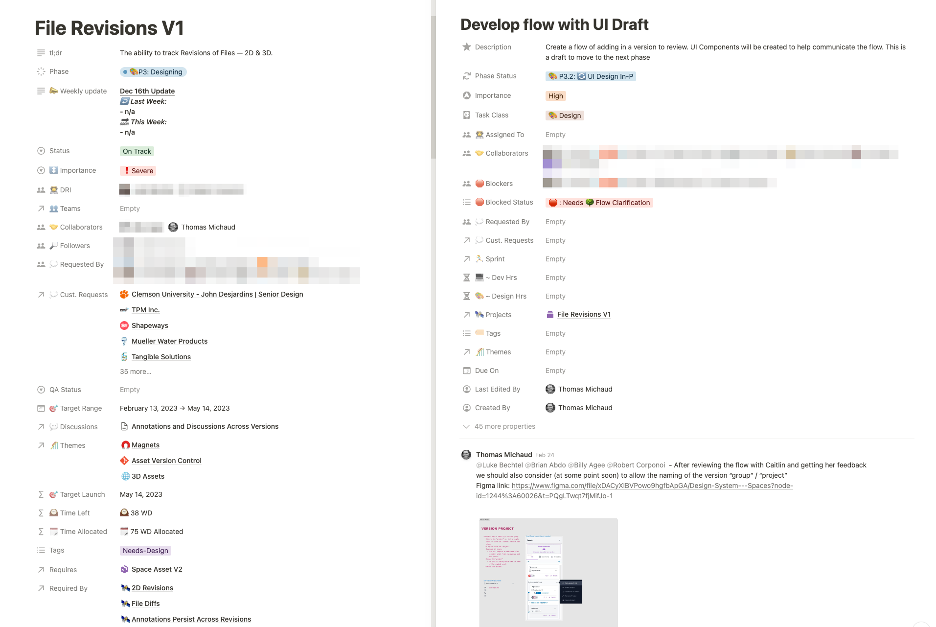
Exploration helped to inform what was necessary for the design. For example, what could be re-used from the design system and determine if I needed to create any new components?
Then, we use these designs to create simple prototypes our customers use to help us determine if the feature is useful and clear.
