CBU Case Study
When was this?
August 2019 – July 2020
Website
What’d I do?
Project Manager and UX Lead: Information Architecture, Content Strategy, Accessibility
What’d I Work In?
Asana
Notion
Google Suite (Docs, Sheets)
Sketch
InVision
Zeplin
Codepen / HTML / CSS
Introduction
Christian Brothers University is a Lasallian university in Memphis with a nationally renowned engineering program topping a long list of remarkable attributes. We partnered with them to build a new site from the ground up to give them the performance, design and usability they needed to introduce the world to the real CBU.
The Challenge
As one of only a handful of Lasallian universities in the country, CBU has some uniquely inherent brand tenants. As one of only a handful of universities in Memphis, CBU also has a strong local connection with a community largely unaware of the Lassaliian tradition.
Our extensive student and stakeholder research led us to develop a new design system and brand voice to better express the totality of CBU’s brand. A clean, modern visual style creates a punchy, yet unobtrusive framework for multimedia assets to convey CBU’s personality. An honest and direct brand voice with a casual tone enables the University to connect with—as opposed to talk at—prospective students. The overall impression offers an authentic portrait of CBU that continued user research indicates has bolstered trustworthiness and brand comprehension.
Discovery
Conducting interviews with administrators, staff, faculty and students helped to see patterns in frustrations and delights. We took the opportunity to co-design and ask what would help them in the use of the site.
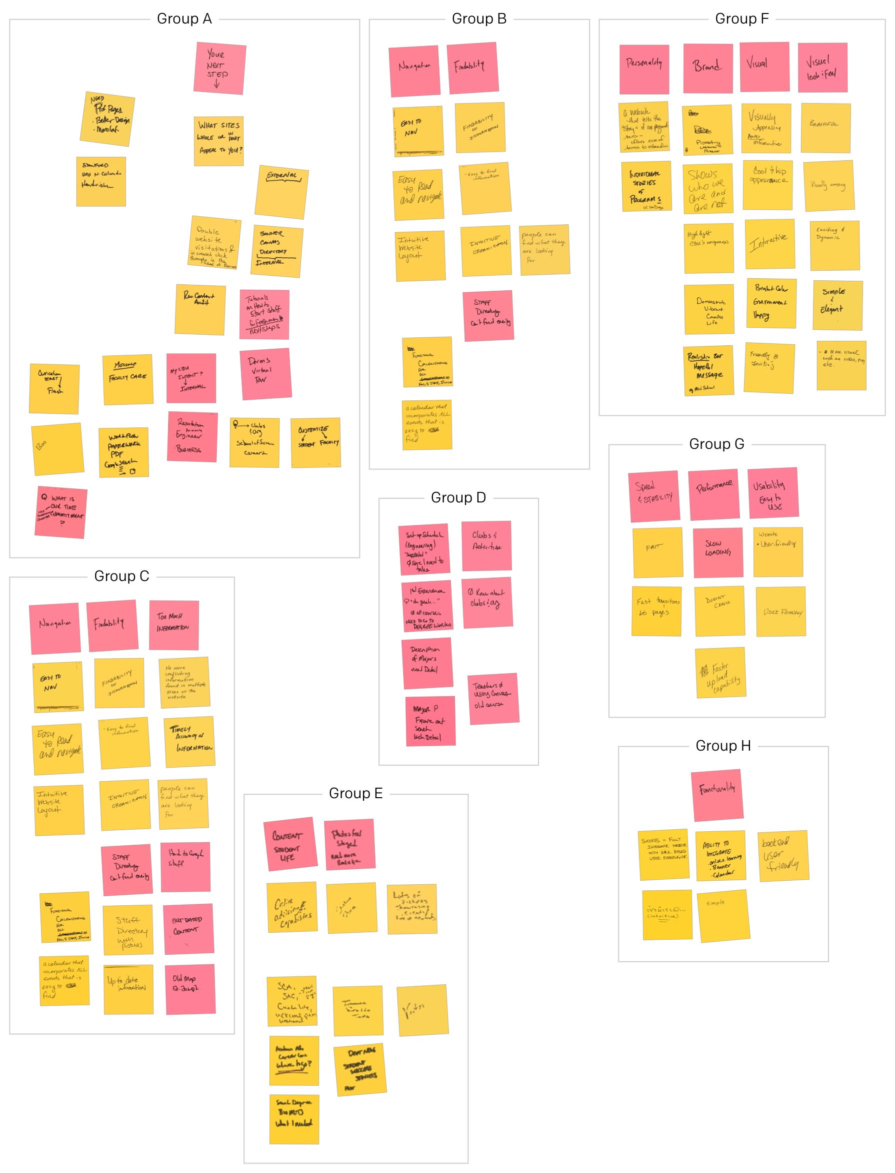
Spending time with a product and working through common tasks flows for faculty and students helps to identify where pain-points are in the current system. I then compare those task flows with research of another university’s task flows. Often times the common patterns help formulate quick solutions to problems other universities have already solved.
When generating a task flows for a project in higher education (or most any educational institution), you might have some basic user stories you can develop:
As a [description of user], I want [functionality] so that [benefit].
As a prospective student, I want an easy way to apply, so that I can submit my application.
While CBU already had this task flow, we needed to improve the experience. How can we measure our success? Does the flow we’ve created help the student complete their task more easily than before?
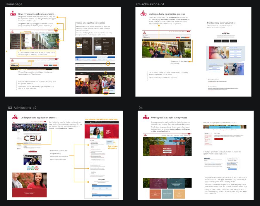
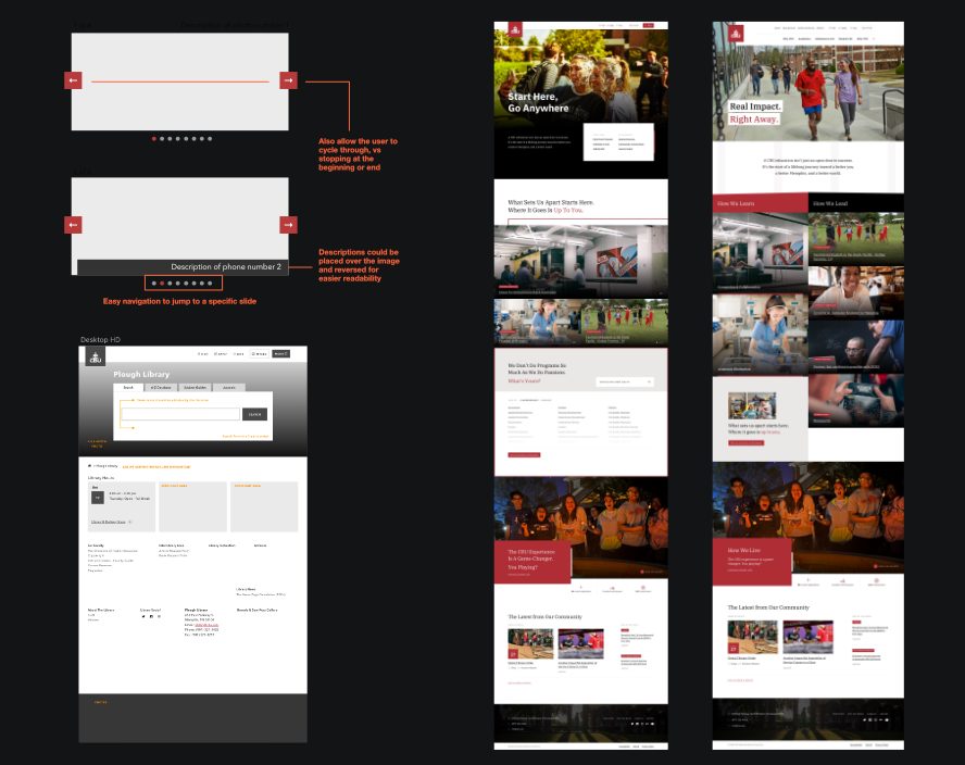
- Improve visibility for important call-to-action buttons and avoid icon-only buttons. A pencil icon, for the Apply button, was placed on top of a photograph.
- Make sure navigation wording matches the page the user lands on to avoid confusion. The Future Students navigation item brought you to the Admissions page.
- Call-to-action should be clearly visible and not competing with other, larger, elements in close proximity. Give buttons more breathing space. On the Admissions page, there were seven buttons near each other. Four (of the seven) buttons above a large photo were too dark and did not stand out.
- Provide a clear outline of the steps involved. CBU didn’t have any progression of steps and dates to help inform the applicants.
- Create separate areas for undergraduate and graduate applications. On the CBU site, there were many links for undergraduate and graduate programs on the same page.
Solutions
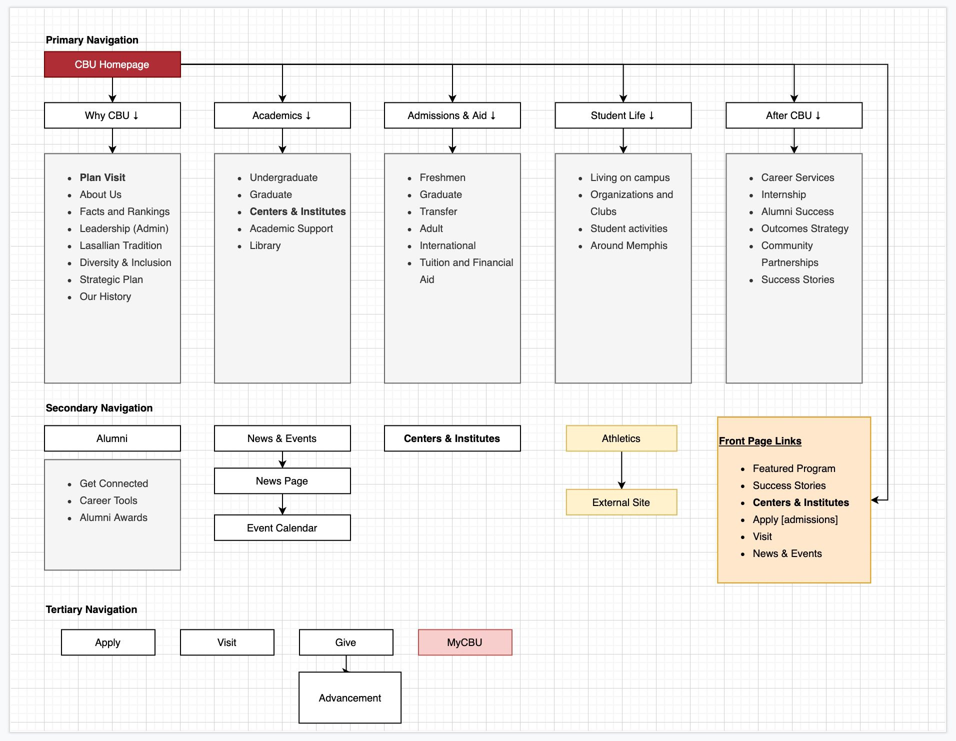
Structure
IA, content strategy and design coalesce to elevate the presence and status of CBU’s academics. Programs have been decoupled from the schools and departments that run them and sorted by a taxonomy aligned with user expectations—not internal organization. Programs share a standardized template that is also highly flexible, allowing for unique customization while retaining recognizable user patterns. Each program is a custom post type, allowing it to be referenced easily in a variety of ways and places throughout the rest of the site.
Storytelling
Our research and discovery revealed a sizable gap between CBU’s value, both actual and perceived, and the school’s ability to promote its value. We took the opportunity to lift up student success stories across multiple areas of the site, putting emphasis on the mechanisms CBU has in place—both academic and extracurricular—for enabling success.
We also expanded the definition of success. While employment outcomes are key to highlighting CBU’s value, community connection, service, and improvement are all important facets of success for a student body overwhelmingly driven to do good for others.
Beyond the classroom
Bolstering academic content doesn’t begin and end with the classroom. We’ll give both strategy and design consideration to surfacing and promoting centers (such as the Center for Entrepreneurship), experiential learning opportunities, and other avenues by which CBU’s learning environment extends past campus and into the surrounding community and beyond.
Voice and Tone
- Honest
- Direct
- Smart
- Supportive
- Approachable
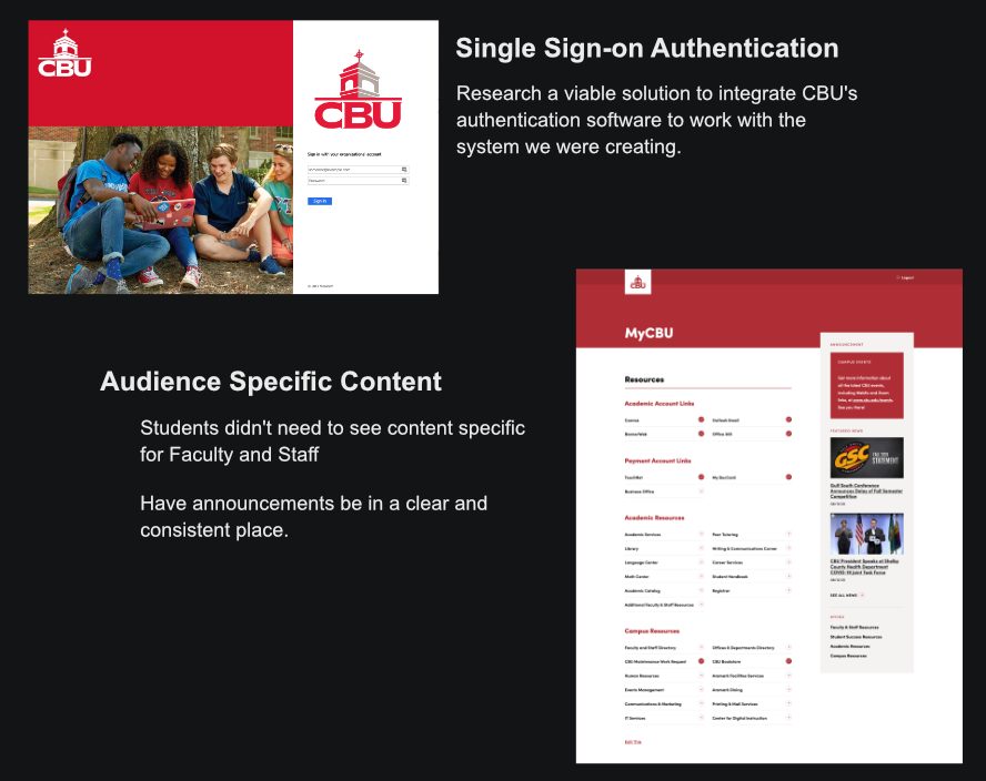
Internal Audience
CBU’s site didn’t have an intranet. An overwhelming amount of content for internal audiences was bogging down the site, bloating the IA and creating frustrating user flows for prospective audiences. We created an authenticated experience for current students, faculty and staff, and other internal audiences to keep the public site as streamlined and prospective-focused as possible.
Performance
Site performance was a major objective at the onset of this project. We built the new site on a modern CMS which we kept clean and free of excessive plugins and chose a fast host server with quick performance. We’ve employed best practices for modern web development, from concatenated and minified JavaScript and CSS to responsive images optimized to reduce bandwidth. And we’re using performance-boosting services, such as Cloudinary and Varnish Cache, to further optimize images and speed up content delivery across the site.
11x faster than the previous site
Page count was reduce by 50% with a more efficient Information Architecture
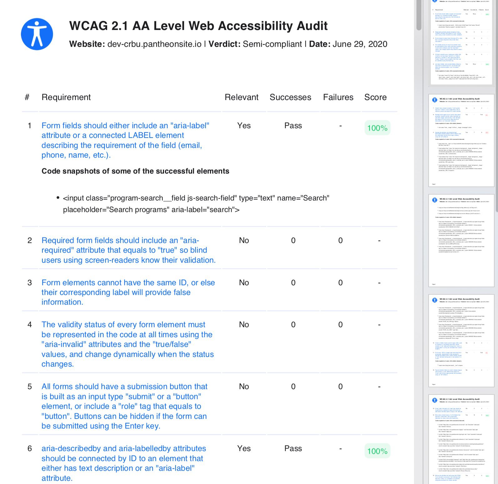
Accessibility
Many universities struggle to make their websites fully accessible to people with disabilities. We used different accessibility tools, and continual manual and automated testing throughout development, to achieve compliance with Web Content Accessibility Guidelines (WCAG) AA standards. To maintain this standard, Christian Brothers University has an Accessibility Policy page containing their commitment to publishing inclusive webpages and instructions for contact if an area needs work.